Room Color Combination Ideas to Create a Beautiful, Cozy, and Stylish Home
A room can feel completely different with just a fresh coat of paint. The right colors can make a small bedroom feel more spacious, turn an ordinary living room into a welcoming retreat, or give a simple space the elegant look of a professionally designed home. The secret isn’t choosing the most expensive furniture or following every decorating trend. It’s finding colors that work beautifully together and reflect the atmosphere you want to create.
The best room color combinations bring walls, furniture, curtains, bedding, rugs, and decorative accessories together in a natural way. Some shades create a peaceful mood, while others add energy, warmth, and personality. Even a simple combination of two or three colors can make a remarkable difference.
For anyone planning a home refresh, these 12 room color combination ideas offer inspiration for creating attractive interiors without making decorating complicated. From timeless neutrals to bold, modern pairings, each combination offers a different way to bring beauty and comfort into everyday living.
Beige and White for a Timeless, Elegant Look
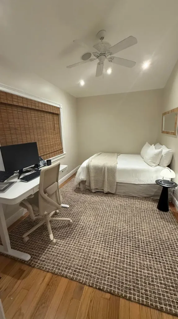
Beige and white create one of the most versatile color combinations for a home. These gentle neutrals work beautifully in living rooms, bedrooms, guest rooms, and open-plan spaces. White keeps the room feeling fresh and bright, while beige adds warmth that prevents the interior from looking too plain or cold.
A beautiful way to use these shades is to paint the walls warm white and introduce beige through a sofa, upholstered headboard, curtains, or area rug. Natural wood furniture adds another layer of warmth, while woven baskets, ceramic vases, and linen cushions create a relaxed, finished appearance.
This pairing is especially helpful in rooms that receive limited natural light. Warm white walls can make the space feel more open, and pale beige furnishings maintain a soft, welcoming atmosphere. Choose creamy whites rather than icy whites if the beige has yellow or golden undertones. For a more luxurious finish, introduce brushed brass lamps, textured cushions, and a few dark wood accents. These small details add contrast without disturbing the peaceful color scheme.
Best for: Living rooms, bedrooms, small apartments, and minimalist interiors.
Decorating tip: Combine at least three textures, such as linen, wool, and natural wood, to keep the neutral palette interesting.
Sage Green and Cream for a Calm, Nature-Inspired Room
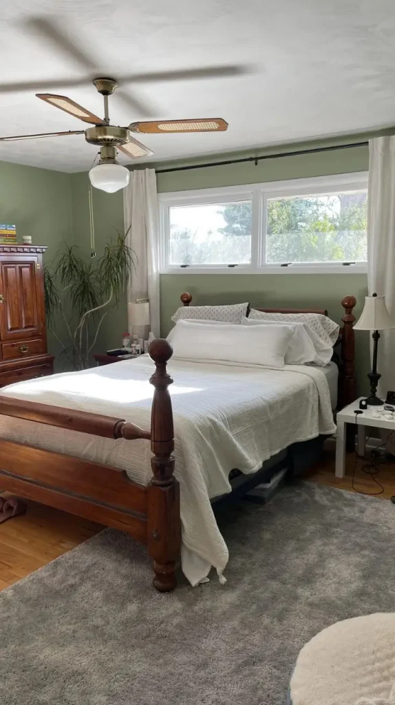
Sage green and cream bring the soothing beauty of nature indoors. Sage has a muted green appearance with gray undertones, making it softer than bright green. Cream adds warmth and balances the coolness of the green, creating an interior that feels peaceful, comfortable, and effortlessly stylish
For a living room, sage green walls look lovely beside a cream sofa, light oak coffee table, and neutral curtains. If painting the entire room feels like too much, start with a single accent wall behind the sofa or television. Cream-colored walls can also serve as a backdrop for sage green cushions, upholstered chairs, or decorative artwork. In a bedroom, this combination creates a restful setting that feels connected to the outdoors. Cream bedding, a sage green throw, and wooden bedside tables produce a layered look without overwhelming the space. A few indoor plants can strengthen the natural atmosphere.
Sage green also pairs well with terracotta, muted gold, and warm gray. These additional shades can introduce personality while preserving the original softness of the design. One important detail is the room’s lighting. Sage green can appear grayer in cool artificial light and more vibrant near a sunny window. Testing a paint sample on different walls helps reveal how the color changes throughout the day.
Best for: Bedrooms, reading corners, living rooms, and nature-inspired interiors.
Decorating tip: Use cream as the main background and sage green as the secondary color for a balanced, relaxing effect.
Navy Blue and White for a Sophisticated Interior
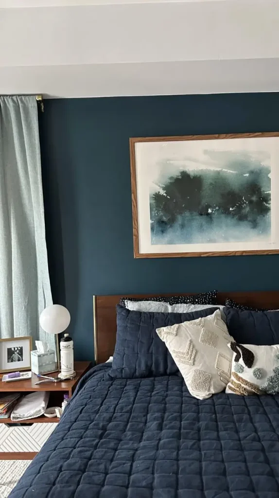
Navy blue and white offer a striking combination that feels classic, confident, and polished. Deep navy creates visual depth, while white brings brightness and prevents the darker shade from making the room feel too heavy.
A navy blue accent wall can become the focal point of a living room, especially when paired with white walls, a pale sofa, and light-colored flooring. White curtains help maintain an airy feeling, while navy cushions or a patterned rug connect the colors throughout the space. For bedrooms, navy blue works particularly well on the wall behind the bed. White bedding creates a crisp contrast, and natural wood furniture softens the overall appearance. Adding a warm bedside lamp or brass hardware can make the room feel more inviting at night.
This combination also suits home offices and study areas. Navy brings a sense of depth and formality, while white keeps the surroundings visually clear. However, a small room with little natural light may benefit from navy furniture or accessories instead of navy walls. The secret is controlling how much dark color appears in the room. A generous amount of white, combined with reflective surfaces and layered lighting, helps preserve balance.
Best for: Modern living rooms, bedrooms, home offices, and classic interiors.
Decorating tip: Introduce light gray, warm wood, or brass accents to soften the strong contrast between navy and white.
Dusty Pink and Gray for a Soft, Modern Space
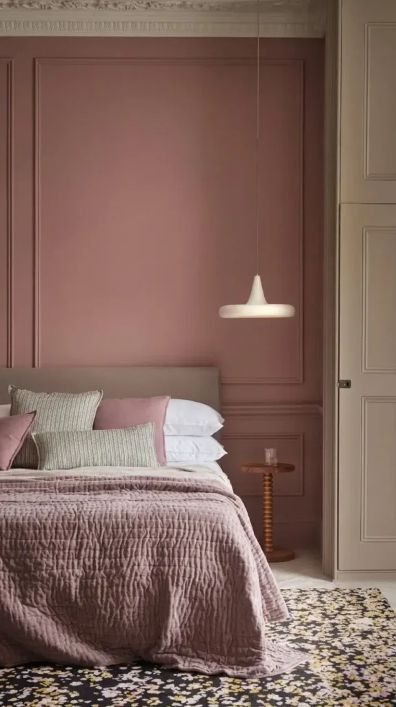
Dusty pink and gray create a gentle, contemporary look without making a room feel overly sweet. Dusty pink has muted rose undertones, while gray provides a neutral foundation that balances its warmth. Together, they work beautifully in bedrooms, sitting areas, and stylish guest rooms.
A practical approach is to keep the walls light gray and introduce dusty pink through bedding, cushions, curtains, or an upholstered chair. This arrangement feels subtle and easy to update. For a more decorative look, a dusty pink feature wall can sit behind a gray headboard or sofa. The undertones matter when choosing gray paint. A warm gray with beige undertones often complements dusty pink more naturally than a very cool, blue-gray shade. This small choice can make the entire room feel more cohesive.
Metallic accents add another layer of sophistication. Rose gold, brushed brass, or matte black lamps can give the room a finished appearance without introducing too many colors. Soft white bedding and textured throws help create a comfortable atmosphere.
Best for: Bedrooms, dressing rooms, guest rooms, and contemporary apartments.
Decorating tip: Choose muted pink rather than a very bright pink for a more mature and versatile interior.
Terracotta and Warm Beige for an Earthy, Cozy Atmosphere
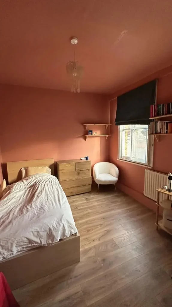
Terracotta and warm beige bring the colors of clay, sand, and sunbaked landscapes into the home. This pairing feels grounded and inviting, making it a wonderful choice for anyone who prefers interiors with natural warmth and character. Terracotta can range from soft clay pink to rich reddish brown. For a balanced interior, use warm beige on most walls and reserve terracotta for an accent wall, decorative cushions, pottery, or curtains. Wooden furniture and woven accessories reinforce the earthy appearance.
In living rooms, a beige sofa paired with terracotta cushions and a textured rug creates a welcoming seating area. In bedrooms, terracotta bedding against creamy walls can add depth without making the space feel dark. This combination works particularly well with natural materials such as rattan, jute, linen, and unfinished wood. A large ceramic vase or handmade-looking lamp can become a decorative highlight without requiring an expensive makeover.
Terracotta can feel intense when used on every wall, especially in a small room. Testing a muted shade first helps ensure the color complements the flooring and furniture.
Best for: Bohemian interiors, rustic homes, cozy living rooms, and warm bedrooms.
Decorating tip: Keep beige as the dominant shade and use terracotta in smaller areas to create warmth without overwhelming the room.
Charcoal Gray and Soft White for a Modern, Minimalist Look
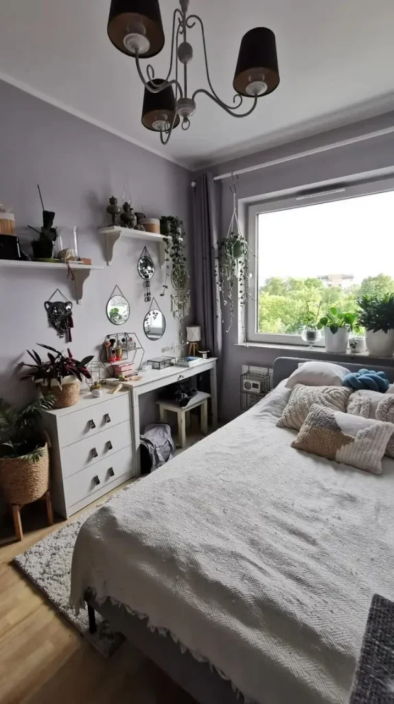
Charcoal gray and soft white create a strong yet elegant contrast. Charcoal adds depth and a contemporary edge, while soft white keeps the overall design clean and balanced. This combination works especially well for people who appreciate simple furniture, uncluttered rooms, and modern finishes. A charcoal accent wall behind a sofa or bed can establish a strong focal point. Pair it with white walls, pale flooring, and streamlined furniture to prevent the room from feeling too enclosed. White bedding, a light-colored rug, and simple curtains are particularly effective in bedrooms.
Furniture can also provide the contrast. A charcoal sofa against soft white walls creates a sophisticated living room without requiring dark paint. Add a pale wood coffee table, textured cushions, and warm lighting to keep the design comfortable rather than stark. The balance between warm and cool tones deserves attention. A soft white with creamy undertones often makes charcoal feel more welcoming. If both colors are extremely cool, the room may appear less inviting, particularly under bright white lighting.
Best for: Contemporary homes, minimalist bedrooms, dining rooms, and home offices.
Decorating tip: Add natural wood, a soft rug, or warm lamps to prevent the dark-and-light contrast from feeling too severe.
Olive Green and Warm White for a Rich, Natural Look
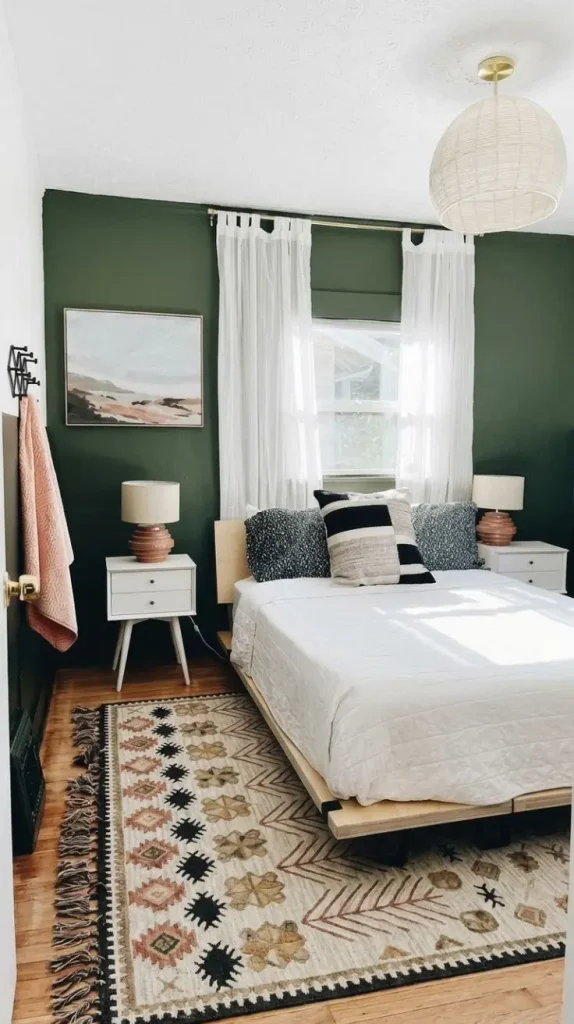
Olive green offers more depth than sage green, making it a wonderful choice for rooms that need a little extra character. Its earthy undertones work beautifully with warm white, which keeps the interior from feeling too dark or visually crowded.
One attractive arrangement uses warm white walls with olive green curtains, cushions, or an upholstered armchair. This approach introduces color without making a major commitment. For a more dramatic interior, paint the wall behind the bed or sofa olive green and use warm white for the remaining walls.
Olive green looks particularly appealing with walnut furniture, natural linen, leather accents, and muted brass details. These materials create a layered appearance that feels established and comfortable rather than overly decorated. In a bedroom, olive green bedding with white sheets and warm wood nightstands creates a restful setting. In a living room, an olive green sofa can become the main feature against pale walls and a neutral rug. Because olive green varies from golden green to deep brownish green, it helps to compare paint samples beside the room’s existing furniture. A shade that looks beautiful in a store may appear much darker under indoor lighting.
Best for: Living rooms, bedrooms, reading nooks, and nature-inspired homes.
Decorating tip: Pair olive green with warm white and natural wood to maintain a rich but balanced appearance.
Light Blue and Sand Beige for an Airy, Relaxed Room
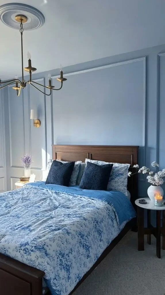
Light blue and sand beige create a calm atmosphere inspired by open skies, sandy beaches, and coastal homes. The blue brings freshness, while beige adds a natural warmth that prevents the interior from feeling cold. For a living room, pale blue walls work well with a beige sofa, natural wood furniture, and cream curtains. Add a few blue-and-white cushions or a patterned rug to connect the shades. The result feels fresh without relying on an overly themed coastal design.
Bedrooms benefit from this pairing because both colors can create a gentle visual environment. Light blue bedding, sandy beige walls, and white sheets make the room feel bright and comfortable. A woven bedside basket or wooden lamp adds texture without introducing unnecessary visual clutter.
This combination is particularly useful in rooms that receive plenty of natural sunlight. Daylight brings out the freshness of the blue, while beige furnishings maintain a sense of warmth. For a more sophisticated finish, introduce muted navy, pale oak, or small touches of brushed brass. These accents add depth while allowing the original colors to remain the main focus.
Best for: Guest bedrooms, beach-inspired homes, small living rooms, and sunny interiors.
Decorating tip: Choose a muted blue rather than a highly saturated shade if the goal is a peaceful, understated atmosphere.
Mustard Yellow and Cream for a Cheerful, Inviting Space
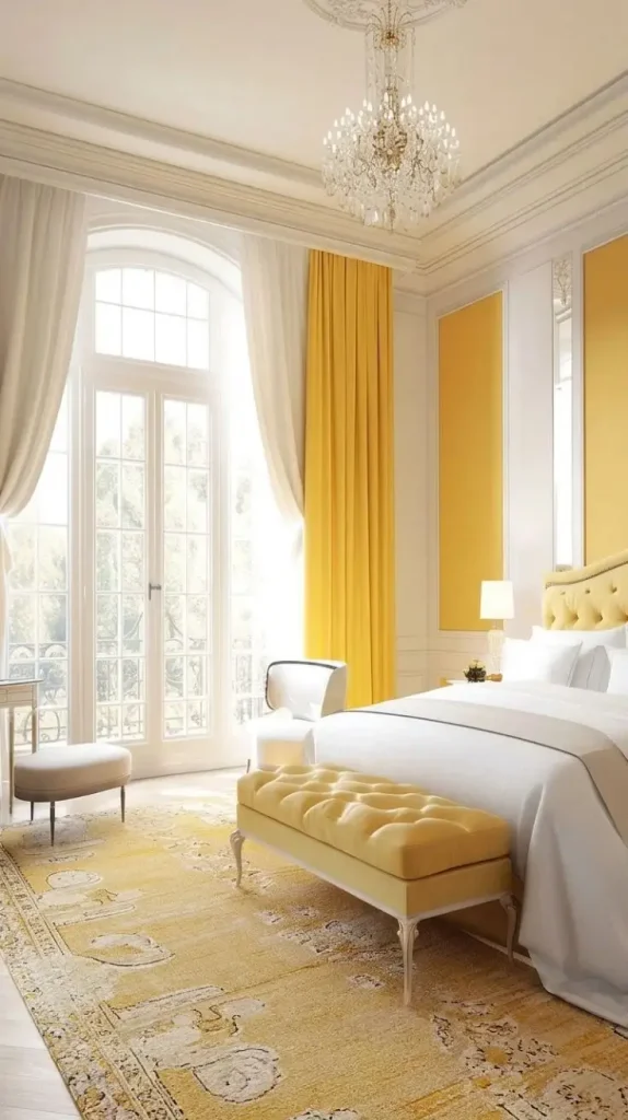
Mustard yellow and cream bring warmth, energy, and personality into a room. Mustard has a deeper, more earthy appearance than bright lemon yellow, making it easier to use in contemporary and vintage-inspired interiors. Cream balances its richness and keeps the space from feeling too intense.
For a simple update, keep the walls cream and introduce mustard through cushions, a throw blanket, an accent chair, or artwork. This method works particularly well when the room already contains neutral furniture. The yellow adds visual interest without requiring a complete redesign. A mustard accent wall can also create a lively focal point in a dining room or creative workspace. Pair it with light wood, simple white trim, and understated furniture to prevent the space from becoming visually overwhelming.
Mustard yellow looks attractive beside walnut, dark green, navy blue, and warm gray. However, it is often best to introduce these additional colors in small amounts rather than treating every shade as equally important. In a bedroom, mustard bedding or a soft yellow throw can add warmth while cream walls maintain a restful foundation. In a living room, a mustard armchair can brighten an otherwise neutral seating arrangement.
Best for: Living rooms, dining spaces, creative rooms, and retro-inspired interiors.
Decorating tip: Let cream cover most of the room and use mustard yellow as a lively accent.
Lavender and Warm White for a Gentle, Elegant Interior
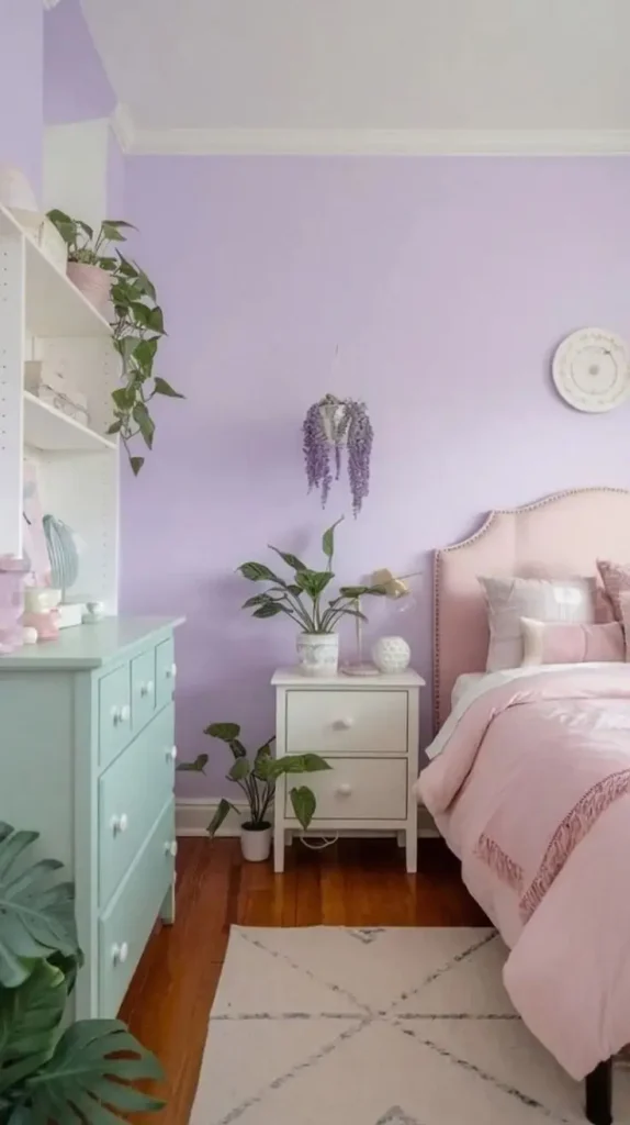
Lavender and warm white create a soft, graceful atmosphere that feels fresh without becoming overly decorative. Lavender has subtle purple undertones, and warm white provides a clean background that allows the color to stand out naturally. A lavender accent wall can bring personality to a bedroom while leaving the remaining walls warm white. Alternatively, lavender curtains, bedding, or decorative cushions can introduce the shade more gently. Light wood furniture and simple fabrics help the interior feel modern rather than overly traditional.
For a bedroom, lavender bedding combined with white sheets and a cream throw creates a delicate, layered appearance. Soft lighting, a neutral bedside rug, and understated artwork complete the setting. The best lavender shades are often those with a little gray in them. These muted versions tend to work well with natural materials and are easier to coordinate with existing furniture than very bright purple tones. Lavender can also be paired with pale gray, dusty pink, or sage green for additional depth. Keeping these secondary colors subdued helps preserve the room’s peaceful character.
Best for: Bedrooms, guest rooms, dressing areas, and soft contemporary interiors.
Decorating tip: Use muted lavender with warm white instead of combining several strong pastel colors in equal amounts.
Black and Beige for a Bold, Luxurious Appearance

Black and beige create a striking combination that feels modern, grounded, and sophisticated. Black provides definition, while beige softens its intensity. Together, they can transform a simple room into an elegant interior without relying on expensive decorative pieces. The easiest way to use these shades is to keep the walls beige and introduce black through furniture legs, light fixtures, curtain rods, picture frames, or a coffee table. This creates a clear contrast while preserving the brightness of the room.
For a more dramatic design, a black accent wall can sit behind a beige sofa or bed. Pale bedding, warm wood, and soft lighting help balance the dark background. In living rooms, black metal shelving and beige upholstered furniture create a polished mix of hard and soft textures.
This pairing also works beautifully with marble-look surfaces, natural stone, linen, and brushed brass. A large mirror can reflect light and make the room feel more open, especially when black appears in several places. In a small room, black is often most effective as an accent rather than the dominant wall color. The goal is to create definition without reducing the sense of space.
Best for: Modern apartments, elegant living rooms, bedrooms, and minimalist interiors.
Decorating tip: Combine matte black details with warm beige fabrics to achieve contrast without making the room feel cold.
Forest Green and Blush Pink for a Distinctive, Stylish Room

Forest green and blush pink offer a beautiful balance between depth and softness. Forest green feels rich and grounded, while blush pink adds a gentle warmth. The contrast creates a memorable interior that feels more expressive than a traditional neutral palette. For a living room, forest green walls can provide a dramatic background for blush pink cushions, a pink accent chair, or soft rose-colored artwork. If painting the walls dark green feels too bold, start with a green sofa or curtains against pale walls.
In bedrooms, a forest green headboard or accent wall looks striking beside blush pink bedding. Cream sheets and warm wood nightstands soften the contrast, while brass lamps introduce a subtle touch of elegance. The key is choosing the right shades. Deep forest green generally pairs better with muted blush pink than with neon pink. The softer pink creates contrast without competing with the green’s richness.
This combination also works with cream, walnut, and antique brass. These supporting colors help connect the two main shades and create a more complete interior. For smaller rooms, use forest green in limited areas and allow blush pink, cream, or white to occupy more of the visible space. This keeps the room feeling balanced while preserving the distinctive character of the palette.
Best for: Statement bedrooms, stylish living rooms, eclectic interiors, and sophisticated apartments.
Decorating tip: Use forest green for depth, blush pink for softness, and cream or natural wood to bring the two shades together.
Read

She has nearly 5 years of expertise in organic gardening, plant pests and diseases, landscape design, horticulture, and permaculture. She is a Master Gardener and Horticulturist.
She includes keywords and phrases that raise the content’s search engine ranking because she has a good grasp of SEO best practices.
- Room Color Combination Ideas to Create a Beautiful, Cozy, and Stylish Home - October 22, 2026
- Hall Colour Combination Ideas to Make Your Home Look Beautiful and Welcoming - October 21, 2026
- Red Christmas Tree Ideas to Make Your Home Feel Magical This Holiday Season - October 20, 2026